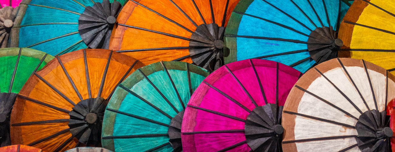

Understanding colour has been a fundamental part of human evolution, reaching far beyond its visual impression to convey deeper sentiments about emotion and meaning, and providing us with tools to navigate our environments. Colour and its application can shape narratives, influence perception and even affect our sentiments. Understanding a colours’ meaning gives us the ability to navigate cues in our environment – be it determining if a strawberry is ripe yet, or whether it’s safe to cross the road – processing the social, emotional and intrinsic qualities of the surrounding world through colour is central to our daily lives.
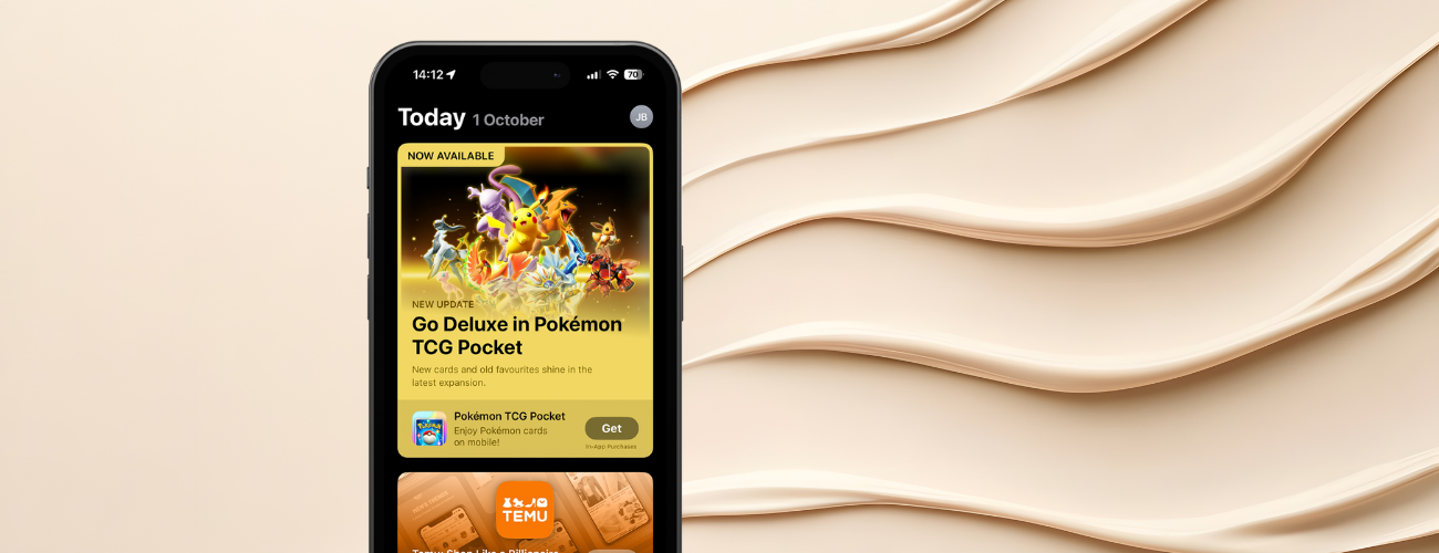
Colour theory is central to consumer psychology, shaping emotions and the subconscious associations people form with your brand. A user thinks about downloading your app within the first couple of minutes of seeing a product, and colour accounts for a huge majority of the information that informs this perception, so making a great first impression counts!
While colours often hold a consistent significance, cultural context can alter the way their meaning is perceived. For instance, red is considered a symbol of luck and prosperity in China, but in many Western countries it is more commonly associated with danger or warning. Therefore, app marketers and designers must understand these variations and how colour should be applied in an App’s creatives.
Why colour theory matters in app marketing
Depending on the product or service consumers decision-making can be quick and intuitive. Because of the low barrier to entry users form opinions about your app within the first couple of minutes. Colour theory is also central to the principles of consumer psychology, impacting consumers’ emotional states and the associations they subconsciously form between emotion and the perceptions of your brand.
In the case of app marketing it is important to:
- Improve brand recall and recognisability.
- Boost click-through and download rates by fostering user engagement.
- Evoke desired emotions, set user expectations and influence brand considerations.
Colour psychology: emotions & meaning
Both consciously and subconsciously, colour psychology can impact users’ perception and experience with your app. Understanding the links between colour and meaning can help to tailor your app design to the user experience you’re hoping to create. A fitness app, for example, might combine green to signal personal growth and blue to evoke trust. In contrast, a meditation app might combine orange and yellow to provoke happiness and enthusiasm.
Using these insights, you can tailor colour and design choices to support your app’s overall goals.

Design Psychology: The Von Restorff Effect
The Von Restorff Effect, also known as the “Isolation effect”, states that when multiple elements are presented together, the one that differs the most is more likely to be remembered. In app marketing, this can be applied to:
- Designing bold CTA buttons that contrast with the background
- Using accent colours or popping UI to draw the eye to key features in screenshots
- Ensuring your app icon stands out against a sea of competitors on the App Store
Think about how notification badges on phones use bright red circles (another example of the Von Restorff Effect). This colour is chosen specifically because it demands attention. You can use similar tactics to boost discoverability and click-through rates in your app marketing.

Cultural variations in colour meaning
Colour may speak a universal emotional language, but its meaning and implications can vary across cultures. For global apps, understanding these cultural variations is critical for engaging your target audience.
Western colour associations
- Rainbow: widely known as a symbol for LGBTQ+ pride, joy and inclusivity.
- Purple: historically linked to royalty due to the rarity of purple dye. It is often linked to wealth, status and class, but can also represent creativity.
- Blue: associated with trust, security and authority. It is widely used in medical, business and productivity fields.
- Green: associated with nature, green can symbolise growth, prosperity, and environmental responsibility, but is also used to reflect monetisation.

Chinese colour associations
- Yellow: historically reserved exclusively for China’s emperors, symbolising imperial power and wealth. Gold also has similar associations with success and good luck.
- Red: symbol of luck, joy, celebration, and good fortune, it is frequently used in festivals, weddings and celebrations, including Lunar New Year.
- Orange: associated with feelings of warmth, joy and positive energy.
- Blue: associated with water, blue is perceived positively, with links to calm, peace, and dependability. Because of these positive associations, it is widely used by corporations in China, echoing credibility and trustworthiness.

Understanding variations in colour theory enables you to apply these insights effectively within App Design. For instance, when designing UX for a Chinese app, you might consider utilising gold details, orange or red CTA buttons, and yellow accents to convey luck, prosperity, and success subtly.
Nigerian and African colour associations
Colour significance often ties to tribal, spiritual, or ceremonial contexts, with bold primary colours symbolising community, status, and vibrancy. For instance:
- Red may denote strength, power, and passion, but it can also symbolise aggression and death, so it should be used carefully within design.
- White can represent purity, peace and celebration, but is also associated with spiritual rituals.
- Blue: denotes trust and reliability – this is one of the most universal colour symbolisms, with slight variation in meaning between global cultures.
- Green: strong associations with life and nature, it is often utilised by Nigerian businesses to reflect growth and eco-friendly approaches.

App marketing tip:
When localising your app’s creatives or screenshots, don’t just translate language; adapt your colour palette to the region. A red-dominated interface might boost engagement in China, but it feels overly aggressive in Western health apps. Do your research and understand how colour theory in your designated region may influence user associations and perceptions of your brand.
Case studies: colour theory in action
Duolingo
Uses vibrant green, a colour associated with earth and nature, which helps to symbolise progress and positivity.

Tinder
The use of pink and orange gradients evokes warmth, flirtation, and energy, matching the brand’s tone.

Calm
Uses soft blues and gentle purples to promote a tranquil experience, which suits both their brand persona and is reflective of the user experience they hope to achieve.

Underpinning your app strategy with colour theory
Here’s how to utilise colour theory work for your app:
1. Define your brand emotionally
What feeling should your app evoke? Calm, excitement, trust, or adventure? Start with the desired emotional tone, then choose colours that reflect it and your brand persona.
2. Test your designs
A/B test colour variations in your app marketing, icons, screenshots and in-app CTAs. The results may surprise you, a simple background colour change could lead to improvements in conversion for your localised market.
3. Understand your audience
Don’t apply Western colour associations everywhere. Research and adapt your palette for each key market to ensure cultural relevance and respect.
Conclusion: Colour as a mobile marketing strategy
Colour isn’t just how your app looks, it’s how it feels. It tells a story before users read a word. It draws the eye, shapes expectations, and defines your brand. By applying psychological insights, cultural awareness, and design principles like the Von Restorff Effect, app marketers and designers can turn colour into a powerful driver of engagement and growth.
So, the next time you revisit your app’s icon, screenshots, or onboarding screen, ask yourself not just what looks good, but what feels right for your users. Ready to take your app’s design and growth strategy to the next level? Get in touch with our team to see how we can help.